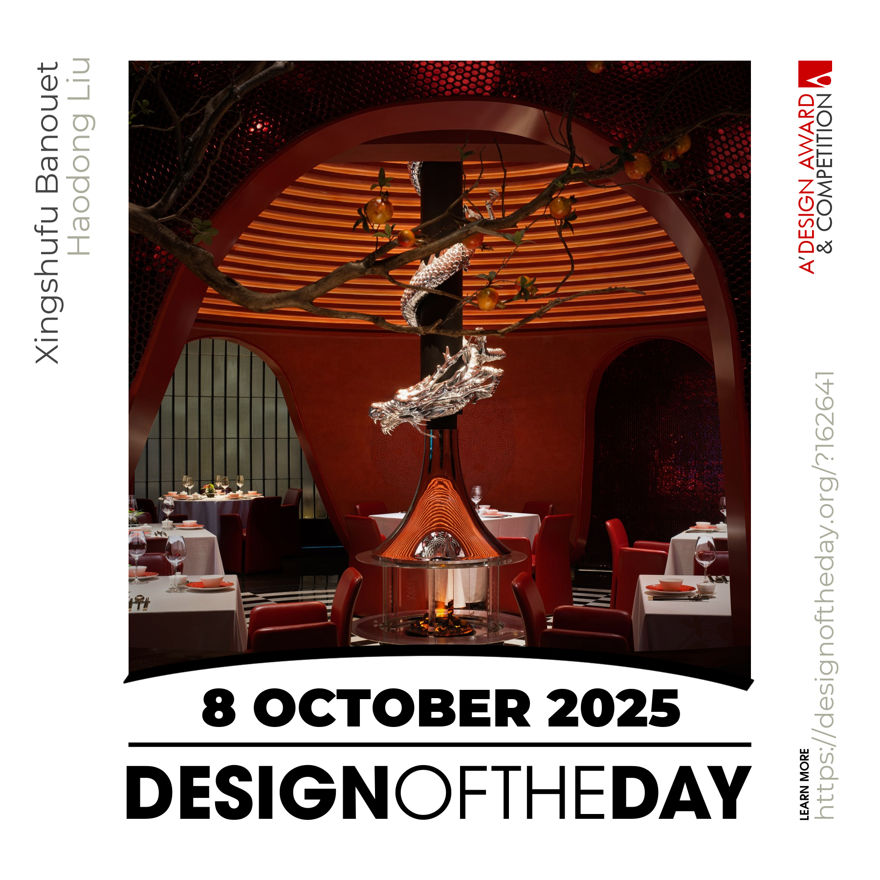
DZGN

DZGN

DZGN featuring great design, architecture, fashion, graphics and innovation from across the globe.


Full

The design language of Full card-case is "hollow out", which explored the relationship between inside function and appearance of the product. A slender hollow has been milled on the body to show the metal Refill inside. The shape formed the proper area for holding the pen, which find the balance between beauty and human engineering. Furthermore, Full weighs 19 grams, which provides good sense of holding to enhance its user experience.

Continue reading


Qui

Qui (which in Italian means here) is a magnetic pencil and pen holder that makes everyday life easier. Qui allows to stick a pen or pencil wherever one wishes. The metal disc is adhesive, so it can be applied to any surface. Just clip Qui onto a pencil or pen and thanks to the magnet it can be attached anywhere to always know where to find it.

Continue reading


Eternity

The universe and all things move eternally in a circular motion. The circle is eternal, infinite and unique. What’s more, “eternity” magnifies the concept of circle and presents it with scattered texture on the body of the pen, interpreting the eternal definition. The body of the pen is made of metal aluminum, which is machined and polished with high precision CNC aluminum tube to create a delicate texture on the surface of the pen. Thick copper pouring pen clip, with spring structure, shows the high-end nature of the pen.

Continue reading


Elte Btk Hok

Elte Btk Hok is a unique identity and webdesign for Eotvos Lorand University, Faculty of Liberal Arts, Students Union representing the Students Unions values. By redesigning the old vintage looking logo, a new basis was provided for the renewing identity and online appearance. The design team overwrote the structure of the eleven page website, researched and analyzed the webdesign trends, in addition to this several usability tests were conducted to ensure that the final website was easy to use and aesthetically pleasing.

Continue reading


Lifelong Online

Centrick set in place a brand guideline that matched speed with aesthetics. A clean and minimal style of photography was used to simply showcase the core of every product while reducing the deliberate clutter around them. It enabled them to shoot 130 products, catalogued in 300 shots, in just 32 hours. This rapid photography system enabled real time communication, a mandate for e-commerce. To maximize performance they took an extreme approach and challenged the very core of the platforms. A consolidated and integrated design approach was used to create this online destination.

Continue reading


Unfinished Farewell

Unfinished Farewell is an online space to commemorate the people who have left us because of the pandemic. When visitors enter each person's "tomb", they can see their stories and the help-seeking information they posted before they passed away, and leave a message. Behind every number is a life. The website is designed this way so that, when visitors enter this space, they can sense that sort of atmosphere: sorrow, grief, solemn, melancholy, mourning, agony.

Continue reading


Amazing design. Good design. Best design.

Good designs create value for society. Everyday we feature a special design project that demonstrates excellence in design. Today, we are pleased to showcase an award-winning design that makes a positive difference. We will be featuring more great and inspiring designs daily. Make sure to visit us everyday to enjoy new good design products and projects from greatest designers worldwide.

Continue reading